- Last lesson you learned the essentials of designing a good character for your children’s book. Good Character Design – the character ‘s traits need to be easily understood by little children. Therefor the character’s design needs to speak what the character is like. There are THREE basic principles to help you design well: Silhouette, Palette, and Exaggeration, Oh ya, and EYES – they are real important to little kids. Character consistency- the character’s proportions of legs and arms, and the size of its head should stay consistent through the story. Practice drawing the head the same size in different expressions and positions.
The next stage of children’s book illustrating is to design the book pages. How many pages? what will be illustrated? Will there be single pages? Double page spreads? Half pages?
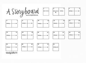
The Storyboard –. You will need to make a comic strip style storyboard upon which you need to plan out each page’s illustrations. This is how you pace your story accurately.
On your storyboard you indicate the double page spreads and the single page illustrations. Write the story words for each page UNDER the applicable page.
Your storyboard is NOT your finished storybook -it is simply your plan. The diagram here shows how you need to draw storyboard.
Too many pages on this picture of a storyboard, however you get the drift.
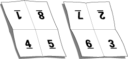
Number of pages for your book– use multiples of 8. This is because books are printed on large sheets of paper that are subsequently folded down to the final size. Four pages on the front of the large paper, and four pages on the back. These 8 pages on one large sheet are called a signature:
Front side of paper Back side of paper
In keeping with this, for our class project, in an effort to authenticate your experience, you need to make your book 16 pages. Do not fear!
Pages 1 and 16 are end pages that are to be left plain to glue to the cover.
Page 2 is the page for the credits and page 3 is the title page. OR you can make pages 2 and 3 the double page spread title page – you choose.
So you are now down to 12 pages left. Several of the 12 pages will be “double page spreads” that is two pages together to make one large illustration. If you have, maximun, 4 double page spread in your book (4 large illustrations) then that takes 8 pages to make. 12-8= 4 single pages left to illustrate. 4 single pages, and 4 double pages = total 8 total pages to illustrate. You might choose to make only 2 or 3 double page spreads which then give you a few more illustrations to make but might do a better job of illustrating the story. Illustrators tend not make all pages into double page spreads because it can make viewing the book too boring. All single page illustrations can make the story look choppy.
You can take the option of making a 24 page book, instead of 16 pages, if you are that ambitious.
Decide : will the pages be Landscape format or portrait format – which best supports your art. Does the long side lie horizontal (landscape) or vertical (portrait). Cut all of pages to your chosen format and size, cutting the double pages and single pages. DRAW YOUR LADDER USING THE FORMAT YOU SELECT.
What parts of the story do I illustrate? you can only illustrate certain parts so pick the MOST SIGNIFICANT . Pace the story carefully main actions and events get their own page. Minor actions do not get a page of their own. Major event each get own page.
Illustrations need to show the story. Do not rely on the words to tell the story- the illustrations should do this. A good illustrator does not leave the story to the writer.
Number of words per page. Illustrators suggest no more than 50 words per page. But it can be much less, and even none if your illustrations tell the story on their own on some pages. Remember the words of the story go BELOW the pages on your stroyboard (Not necessarily on the good copy of your story). You write them below so you can focus on your illustration composition in the storyboard thumbnails. YOU ARE NOT WRITING THE STORY, you are copying the words. This project is Not a writing project.
Dividing the page – each page can have one of the following options – a) a half page picture, b) a full page picture, or c) a fading off picture
Here are a couple of innovative ways to divide the page up for storytelling images:
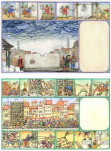
one page and two “vignettes”:
Double page spread with lots of vignettes (note space left for words):
Your illustrations need to make a space for the words. Where do the words go – they can go below or above the picture, beside the picture or on the picture – you decide. Some illustrators get super fancy with the words part of the story.
Sudden surprise picture – if a picture shows a sudden surprise then that picture should go on the left side page so that when the page is turned the surprise appears.
Direction of actions in a scene –normally goes from left to right, for example if a character is running they should run from left to right. This is because we read this way. HOWEVER, if there is a “homecoming” action in the story the action should be moving from right to left. This indicates “coming back” or “returning”.
YOU NOW NEED TO PREPARE YOUR STORYBOARD. DRAW a set of 16 small representations of the PAGES FOR YOUR BOOK. In Your storyboard each square page should only be about 2 inches. It is a plan, NOT the real book Use the FORMAT (portrait or landscape) for your storyboard pages that you are going to use for THE GOOD COPY FORMAT. LABEL EACH PAGE NUMBER. ASSIGN THE COVER PAGE to the first, single page of your storyboard. (illustrators decide on the cover design illustration at the very last of their illustration work -Sometimes they use one of the inside pages as the cover illustration, sometimes they make a different title page) . Pages 2 and 3 (the example below calls them pages 1 and 2) are the inside credits and title page. Page 4 and 5 are the beginning of the story. Sketch in your illustration LAYOUT on every page. Write the story words (copied) underneath the pages. This example has planned where the words will go in the illustrations. You need to decide where your authors words will go. Here is an example of an author’s storyboard plan for their children’s book:
example 2 -32 page: :
YOUR STORYBOARD (the thumbnail sketches plan for your children’s book) is DUE THIS FRIDAY.
All of the above criteria must be accommodated in the storyboard:
1. Page placements are correct – Cover page, title page, double page spreads, 16 page signature (or 24 if you are ambitious)
2. Format of pages is drawn correctly – landscape or portrait format
3. Word placements are planned for
– words written BELOW the pages so that you know what happens where
and
– space left on the page indicating where the words will go
4. All Illustrations are sketched in -in pencil, no colour needed.


