Equilibrium Project- Aryan. H, Daejung. C, Yael. E- Physics 12

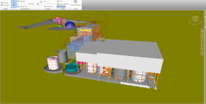
For our equilibrium project, we decided to explore the second condition of equlilibrium which states that the net torque acting on an object must be zero. We did this by creating a system in which the net torque was zero as the system was perfectly balanced.

Originally, we only had the bottom layer, however, we decided to add an additional layer to add to the complexity of the system. If you look closely at the bottom layer, it isn’t in equilibrium as the weights are not in the proper places whereas the top layer is in equilibrium as the masses are at the appropriate distances. This was do to balance the bottom layer and create the illusion that they are two independant bodies somehow stacked on top of eachother when in reality, it’s simply one layer balancing the other. 


Below is our calculations as well as our sources of error for the system that we made:

Loader Loading...
EAD Logo Taking too long?

Reload Reload document
| Open Open in new tab

Download


Reflection:


Complexity: I feel that our project was fairly complex as it was one system that was composed of 2 seperate systems. We had two pivot points where we used highlighters which contributed to that complexity as it it was harder to balance these masses on such a small surface area. 5/5


Creativity: I beleive that our project was fairly creative. We wanted to make a project that took the theme of school supplies and thus we opted for using rulers and highlighters. We could have used more stable objects such as wooden blocks for our fulcrums, however, we wanted to show how creative we could be while still conserdering a challenging design. 4/5


 Calculations: Our calculations were very clearly organized and labeled. 5/5


What did I learn from this experience?

From this experience, I am starting to feel more comfortable with the concept of equilibrium. It allowed me to experiment with the concept and understand how exactly it would work in a real life situation. I noticed how small difference like the position of the mass on the ruler and the position of the fulcrum could drastically affect the project. Overall, I feel that this was a very good way of demonstrating equilibrium.


What do I think went well

I think we worked well together as a team. We were able to figure out exactly what we wanted to do and efficiently put it together. We all had a very good understanding on how equilibrium worked which aided us in making this project. We contributed equally towards the construction of the project and the calculations. I am also happy that we made a project that really demonstrates the second law of equilibrium as it is often the more complex out of the 2 laws and having a visual understanding helps a lot.


What would I have done differently, given the chance? 

If I could redo this project, I would see if I could possibly stack another layer on top; making 3 total layers. I feel that this would make our project even more complicated and interesting. This would add much more volume to our calculations and more forces that we would have to take into account. However, I feel that we did a very good job with this project and I am happy with how it turned out.


Loader Loading...
EAD Logo Taking too long?

Reload Reload document
| Open Open in new tab

Download

ENG11-Theme Park Project Reflection

    As we read through the novel Fight Club, we discovered many themes that covered a variety of topics such as masculinity and consumerism. Chuck Palahniuk, the author, poured his own views and feelings towards society into this story whcih not only demonstrated this, but potrayed it through an internal conflict withtin the characters.

    As our final project for our book study, we were tasked with creating a “Theme Park” that has rides, shows, and merchandise that all relate to the novel in an unique manner. In our group of five, my part was to design the actual map of the theme park using all the ideas that we had created for the rides and shows. To do this, I used the online program “Icogram” to create the theme park. I had to ensure that all our ideas were effectively translated into the theme park while still being conscious of the limits of the program. Throughout this process, I slowly started to develop my creative thinking competencie as I had to find alternitive ways of making some of the rides as the program didn’t have the exact tools I needed. An example of this is the “Bombs Below!” ride as it was supposed to be similar to a “hellivator” ride. As the program didn’t have what I was looking for, I improvised and used a construction crane and found a way of implementing it into the park without it looking too out of place. However, this is one of many examples of how I was able to use and develop my creative thinking competencies.

    Overall, I enjoyed this project. There were definitely moments where I was faced with a challenge with no clear way around it; but, with a little perserverance and patience, I was able to overcome these challenges and continue my work. This project allowed me to learn a completely new program that could be very useful in future assignments for either this class or other classes.


Loader Loading...
EAD Logo Taking too long?

Reload Reload document
| Open Open in new tab

Download

Mind Map – “A Private Experience”


          “A Private Experience” explores the causes and consequences of ethnic and religious conflicts. The author, Chimamanda Ngozi Adichie, represents this through the eyes of Chika, a young, wealthy, Igbo Christian medical student that travelled to the Nigerian City of Kano with her sister, Nnedi. There, they find themselves trapped amid social unrest between two ethnic groups, the Igbo Christians, and the Hausa Muslims. Chika finds a Hausa woman that helps her seek shelter in an abandoned shop. As Chika and the woman interact with each other, Adiche presents the theme of the story and various aspects that help shape it. I have created a mind map with seven key literary elements to analyze the story and further discover the theme.

          I chose seven images that I believe represent and connect to the seven literary elements: plot, theme, setting, literary criticism lens, point of view, symbolism, and characterization. For the plot, I chose an image of a real protest in the city of Kano. I believe this image is connected to the plot as it expresses the main conflict of the story. Throughout the story, Adichie slowly gives readers more information about the plot using the future tense with her flashforwards that often started with “Later.” In terms of the theme, I chose an image of a Christian figure and a Muslim figure beside each other as it shows the conflict between the Igbo Christians and the Hausa Muslims in the story. Adiche focused on showing readers that regardless of ethnicity or religion, we are all the same. She expresses this through the interaction between Chika and the Woman. Although both come from completely different backgrounds, social status, and religion, they still make a connection through other means; in this case, it was through Chika offering her advice with breastfeeding and the woman treating Chikas’ wound. The setting of the story is in the marketplace of Kano amid riots. I chose a picture of violent riots in Kano to give an idea of what it looks like. The conflict of the story is a real conflict that still continues to this day. However, most of the story takes place in an abandoned store. There is a very clear juxtaposition and irony between Chika and the setting. With Chika being from a wealthy family, it is unexpected that she finds herself amid a dangerous social unrest. However, to further understand the story, I feel that using the biographical approach would be most appropriate. I chose a picture of Chimamanda Ngozi Adichie herself as she has personal experience with ethnic and religious conflict, particularly in Nigeria. Her family was greatly affected by the Nigerian civil war of 1970 that saw the ethnic splitting of nation. Therefore, by analyzing her background, we can see where the inspiration for the story came from. In terms of the point of view, I chose a photo of people pointing fingers at one person as I feel it represents the assumptive thoughts and actions Chika had towards the woman near the start of the story. I analyzed how, through the eyes of Chika, we discovered more about her character and how it changed over the course of the story. However, there was more than the point of view that helped the reader learn more about Chikas’ character. The scarf was a very clear symbol and represented the dynamic change in Chikas’ attitude towards her situation. Near the end of the story, Chika asks the woman if she can keep the scarf; although it had her blood stains from it covering her leg wound that she had sustained earlier in the story. This action by Chika shows that she wanted to keep the connection she made with the woman. For this, I put an similar image of the scarf that Chika described in the story. Lastly, I analysed Chikas’ and the womans’ characters. Adichie used these contrasting characters to show that we can always have a connection with each other because we are all human. For these characterizations, I chose a picture of a well-off woman walking past a homeless man as I feel it represents the contrast between Chika and the woman. However, I also included 2 other pictures that demonstrate their characters well. The first was a picture of a Burberry handbag, the same designer company of the bag that Chika dropped as she was running. This shows her materialistic desires and perspective. For the woman, I chose a picture of a Nigerian street market as the woman described how she was selling onions to make money for her family. Both of these paint a clear description of their characters.

Overall, “A Private experience” demonstrates ethnic and religious conflicts in a very clear and informative way. Adichie used many different literary elements such as the flash forwarding to indulge the reader to think more critically towards the meaning of the story.


Loader Loading...
EAD Logo Taking too long?

Reload Reload document
| Open Open in new tab

Download

Science is MAGIC-Science 10 Honours

For this science project, we were asked to find a science experiment that we could conduct and film that looks like magic but is actually just science.

My partner and I decided that we would use a simple yet interesting experiment and use balloons to demonstrate how it could look like magic at first. We mixed 2 simple household items together, Sodium Bicarbonate (Baking Soda) and Acetate Acid ( Vinegar) to produce CO2 (Carbon Dioxide) gas. Now, CO2 gas isn’t just a normal gas; it is actually much heavier than normal air. But to really demonstrate that fact, we decided to use balloons. In our experiment, we filled one balloon with normal air and by using a water bottle, vinegar, and baking soda, we filled another balloon up with CO2 gas. We dropped them right next to each other and observed that the balloon with CO2 actually hit the ground much faster than the one with normal air did. 

All in all, this project was a ton of fun to film and to do. All the research really intrigued me as I saw all these cool experiments that I could do at home very easily. Especially with spring break being right around the corner, I’m gonna need something to do when I’m bored.


Here is the link to David and I’s video:


Core Competency:


Loader Loading...
EAD Logo Taking too long?

Reload Reload document
| Open Open in new tab

Download

Science 10 Honours- Data Visualization

For this project, we were assigned the task of representing any scientific data in a unique way that gives a clear message.

For my project, I chose to represent the number of Covid-19 related deaths by month in Canada in 2020. I feel that it is very important to understand how the pandemic affected Canada and how much damage it has caused to countless families and communities all across Canada in just the span of 12 months. Below, I have the raw data that I used to help me create my unique visualization of this data:


I have used numerous websites to make sure my information is as accurate as possible including government websites which will be cited at the bottom of this post.


As for my actual representation of the data, I decided to create a sort of infographic that gives you the important facts as well as the number of deaths by month in Canada in 2020:

Link for the infographic: https://create.piktochart.com/output/52333286-covid-19-related-deaths-in-canada-2020

The reason I chose to represent my data in this simple way is because I feel that it is important that subjects such as the pandemic are described and represented in very simple ways. Sometimes simplicity is a much better option as it can be interpreted by almost everyone without much difficulty. It gives the reader the important points and statistics so that they can research further into the topic without being too overwhelmed; something that is very important for serious subjects such as this pandemic. As the vaccines are stating to be distributed around the world, it is important that we start to really look as this data to be better prepared for what the future could bring; however, it is essential that along with the raw data, comes simplified visualizations of the data. As visual learner myself, I have seen myself grow more interested in data that is represented in a easy to understand way rather than just the raw data all at once. 

2020 was a tough year for everyone. However, there is some hope that we can recover from it this year and do better with all the information that we have gathered.


Sources:

https://health-infobase.canada.ca/covid-19/epidemiological-summary-covid-19-cases.html?stat=num&measure=total&map=pt#fn1

https://www150.statcan.gc.ca/t1/tbl1/en/cv.action?pid=1310078501

https://www.ctvnews.ca/health/coronavirus/canadians-age-85-and-older-account-for-over-half-of-excess-deaths-amid-covid-19-statcan-1.5205790

https://www.statista.com/statistics/1107149/covid19-cases-age-distribution-canada/


Desmos Art Functions Card 2020


This project has truly been a journey and I am pretty happy with the way it turned out.

Throughout the process, I encountered many challenges. Whether it was trying to make an parabola fit in a spot or trying to figure out how I can fit an Absolute value function in a picture that was all curves; I always figured out a way around it. I think the best part of this project was its frustrating moments. As bizarre as it sounds, the moments where I was frustrated, where the exact moments that I got the most work done.

In terms of the actual math behind the drawing, it was quite simple. Making the different equations wasn’t too hard in my opinion. It was just very time consuming.

Overall, I am super happy with the end result and excited to end MATH10H with something that really grew my understanding on functions.