This is an astronomy project I did in my Science 10 class, where I created and researched a meaningful question related to space. Here is a Prezi video I made to share my findings:
As mentioned in the Prezi, the sun will eventually run out of fuel and become a red giant star, greatly affecting Earth. This will happen in about 5 billion years from now. Here is a helpful video with more detailed information:
“Discover – Here’s What Happens to the Solar System When the Sun Dies.” ENP Newswire, 10 Feb. 2020, p. NA. Gale In Context: Science, link.gale.com/apps/doc/A613511923/SCIC?u=43riss&sid=SCIC&xid=7debd517. Accessed 21 Apr. 2021.
Gohd, Chelsea. “Stephen Hawking: Humans Must Leave Earth within 600 Years.” Futurism, Futurism, 7 Nov. 2017, futurism.com/stephen-hawking-humans-must-leave-earth-within-600-years.
“Living on Jupiter – What Would Life Be Like On Our Biggest Planet?” Astronimate, Astronimate, 30 Dec. 2020, astronimate.com/article/live-jupiter/#:~:text=Living%20on%20Jupiter%20near%20the%20cloud%20tops%2C%20the,of%20your%20planet%E2%80%99s%20insides%20that%20dictate%20your%20forecast.
“Living on Saturn – What Would Life Be Like On The Ringed Planet?” Astronimate, Astronimate, 31 Dec. 2020, astronimate.com/article/live-saturn/.
This is a project I did in my Science 10 class. I created an interesting visual art piece that represents scientific data, to spread a clear message in an artistic way.
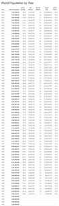
Here is the original raw data that I found. The first chart shows the growth of the world human population, from the 1800s to today. The second chart lists the amount of threatened species in the world, including mammals, fish, birds, insects and plants. (You can click the link to see a clearer version of the first image)
My data visualization art piece is about the relationship between humans and endangered animals across the earth. I chose the topic of animals because it is something I really care about, as well as being a very important issue in the world today. My art piece shows a timeline from the year 1800 to today, with a row of humans above a row of animals. The number of humans is slowly increasing and becoming darker, to show how our population is constantly growing. As this happens, the animals are decreasing and becoming more transparent, which symbolizes the fact that the number of endangered animals is increasing too. The first piece of raw data I found is a human population table, showing how the number grows each year. I noticed that it grew quite slowly at first, but then increased at a higher rate as time went on. The human population was 1 billion in the year 1804, which is why I chose to start the timeline at 1800. The second piece of information I used is a chart about animal species, and how there are more and more threatened ones each year. I think my art combines these two pieces of data in a simple way that shares a clear message. I chose to use a website called Canva to create my art, because I have used it before to create other visual things. I thought it would be a great way to portray the scientific data because images can usually be understood easier than words.
The humans are shown above the animals because I want the message to be that we are the highest on the food chain. I also chose to represent the humans as a simple black symbol because it turns the viewer’s focus to the animals, which is the main part of my art. I incorporated all different animals as well as plants, to show that entire ecosystems are being threatened. I chose pictures of animals in colour to draw the viewer’s attention to this area. I also focused specifically on some of the most endangered and threatened animals right now, such as the blue whale, rhino, elephant, gorilla, and sea turtle. The only numbers on my artwork are the timeline at the bottom and a scale at the top. I wanted to keep it realistic and scientific, so I calculated a scale where each human represents approximately 100 million people. This shows the rapid growth of our human population, especially over the past 20 years. Although many animals have been endangered for much longer than this, I selected only the past 200 years. I also kept out the statistics about the threatened species because that can sometimes be less interesting to read and think about. More visual information makes it easier to understand and see a clear message: as time goes on, there are less and less animals on our planet.
If you look closely, you can see that the very last animal on the right side is an elephant with a sea turtle on it’s back. I wanted this to be a metaphor to show that animals work together in the world to keep each other alive. But as the human population increases, the number of threatened species in the world also grows. If we don’t do something about this issue, I think the pattern will continue in the future and lead to a world with no animals at all. This is why I called it “What Does the Future Hold?” I want people to see that so much of nature is already gone, and more of it disappears every day as we continue to take over the earth. If this keeps happening, who knows what might happen? After people look at my data visualization, I want to leave them wondering and thinking about it. My main goal from this art piece is to show people that if we don’t act now, it may be too late to make a difference.
This is a Science 10 experiment that I did on the first day of the quarter. We reviewed the scientific method by doing a simple experiment with paper airplanes. Each group had to decide on a factor to change about a paper plane, to see how it would affect the distance it flew. My group chose to change the length of our planes by folding up the bottom. We had a control plane made from a regular piece of paper, that was 6.9 inches long. The second plane was folded up 1 inch, to make it 5.9 inches long. Finally, the third plane was 4.9 inches long. These are the three airplanes we made:
My partner and I hypothesized that the distance of flight wouldn’t change at all, because each paper airplane was still the same mass and weight. In the end, our results clearly showed that the longest plane (the control variable) went the furthest. As the planes got shorter, they also flew less. From this experiment I learned that a longer plane can usually fly farther than a shorter one. I think this is because there is more wingspan, helping to keep the plane in the air longer. This then makes the flying distance longer, so it therefore goes farther. I also learned that every attempt in an experiment is different, with results that can sometimes be surprising.
If I were to do this again I would test the paper planes many more times. This would give an opportunity for more detailed and accurate results. I would also test a few more additional planes with different lengths to show me if the pattern in my results continues or not. Overall, this was a great experience for me to remember and practice the scientific method, by doing a simple experiment. I think it was a fun and interesting way to get back into science!