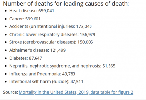
Raw Data:
https://www.cdc.gov/nchs/fastats/deaths.htm
My visual (click on image to see in better quality):
Reason For Choosing Topic:
I tried a few other topics before this one and found that they didn’t really work and that I couldn’t display it in a way that I found was creative or fun. So, I chose the topic of death. I also find it quite interesting. Another reason I wanted to do this topic is because while brainstorming visual ideas, I thought of the way to display Heart Disease and Cancer and figured that there could be similar ways to convey everything else through metaphors/symbols.
Self Reflection:

