Hailey's Blog

My Riverside Rapid Digital Portfolio

Month: June 2016

CBL Skype with Tanya Harrison

Tanya Harrison is a planetary scientist, she is a PHD student in Geology at the University of Western Ontario. She works mostly on collecting data for and from Mars. Aside from all of the hard work she does with Mars she is a professional photographer.

Yesterday in science class we joined Tanya in a Skype call and talked to her about outer space and what she does in her job. Everyone in the class asked her some questions to further our understanding about space.

My question was. “How do we know all this stuff about space if we haven’t been everywhere?”

Her answer was. “With all of the information that we can collect using probes, satellites and landers, they are able to use all of the data to figure it out.”

Question. “How do the Mars rovers move”

Answer. “The Mars rovers are controlled by people on the ground. Because the distance between Earth and mars is very great, the commands to the rovers takes around 40 minutes or more depending on how far away mars is at the moment. Because of how delayed the connection is, the rovers move very slow at speed of 0.14km/h.”

Some other things that I learned from our Skype call is that the rovers have found evidence of liquid water on the surface of mars. They have found streams of salt left from the water after the water has evaporated.

Scientists have also found out that the lost rover that they thought might have crash landed actually did land but malfunctioned during landing.

Before this Skype chat I was very confused and disinterested about space and now coming out of this experience I would love to look more into space.

Statistics

Hailey, Rafael

Statistics

Influences on the collection of data

There are many factors  that may affect the collection of data those include; bias, use of language, ethics, cost, time and timing, privacy, cultural sensitivity, etc. each of these when used can influence which opinion or side a person may choose. For example in use of bias and use of language you can write a question that favors a side for example asking a question like: “You do like pizza, right?” or asking people in an Apple Store what their favourite phone brand is. You can also tilt the answer by asking at different times of the day, normally people in the morning are more moody than those in the afternoon.


Differences between a population and sample

Population means all people in the area or group are surveyed.  This method results in a fair answer.

Sample means only a select amount of people are surveyed. This could through the results of the survey a lot more the population method.


Types of sampling methods

Random sampling: Refers to a set of population in which each member of the set has an equal probability of being chosen. A random sample is meant to be an unbiased representation of a group.

Stratified sampling: Refers to a divided population split into separate groups, called strata. Then, a random sample is drawn from each group.

Cluster sampling: refers to a the total population divided into groups and a simple random sample of the groups is chosen.

Multistage sampling: Similar to cluster sampling, multistage sampling refers to sampling that involves dividing the population into clusters. Then, one or more clusters are chosen at random and everyone within the chosen cluster is sampled.

Systematic random: Refers to a method in which sample members from a larger population are selected according to a random starting point and a fixed, time point.


Differences between theoretical and experimental probability

The difference between theoretical and experimental probability, is that in theoretical probability it is the number of ways that the event could occur. Whereas in experimental probability it is the number of ways that the event has occurred.


Examples of misleading statistics

misleading-graphs-lesson-741

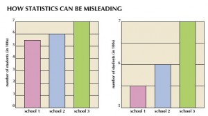
The issue with the first graph is that the starting number at the bottom of the graph does not start a 0 so the graph has a different look. Although they both have the same information the second picture is graphed better because the starting point starts at 0.

3c38e17a218f2a493a5410b7da37d917

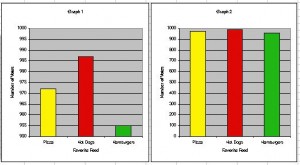
In these pictures the first graph is done better because the starting point is at 0 and there is a larger variety of numbers along the Y Axis, whereas the second picture starts at 5 and there is not a lot of numbers along the side. This results in a different appearance that makes the graph look like it has a different answer.

pie-chart11

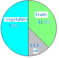
The problem with this picture is that all the numbers added up do not equal 100% rather 105.7% which has now messes up the results because now the numbers are inaccurate.

Powered by WordPress & Theme by Anders Norén

Skip to toolbar