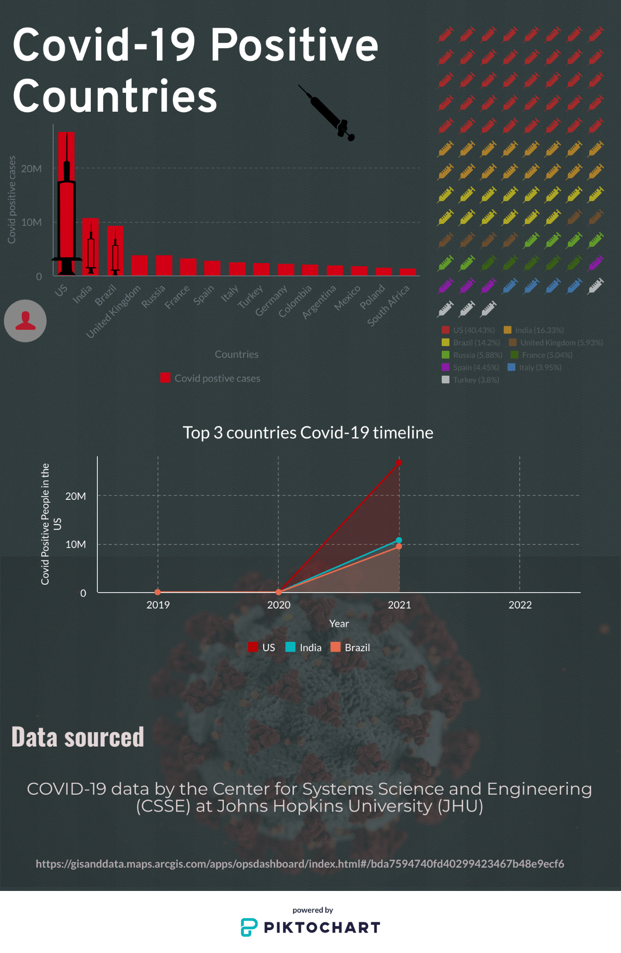
In this data visualization project I’ve chosen the design elements for both ecstatic and for practical reasons. I’ve chosen a black background and bright colouring for the data in order to accentuate the important information that I’m trying to convey. The ecstatic reasoning for why I designed my infographic the way I did was because I wanted the entirety of my project to have an underlying theme, so I’ve decide to use grey and red due to most visual depictions of covid-19 being red. I choose the subject because I knew there would be a pool of recent information that I could find, I also thought this would be a relevant topic since covid-19 has affected many people in the duration of its stay.