
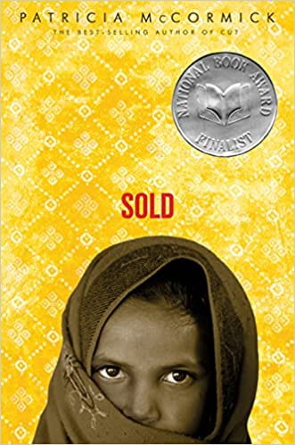
This book cover is from the 2006 edition of “Sold” by Patricia McCormick
I read “Sold”, by Patricia McCormick and the genre of the book is realistic fiction. I personally enjoyed the book because it did not sugar coat the horrific acts of abuse and just plain evil that happens is when a child gets forced into the sex industry or “sold”. The original cover shows a young girl wearing what looks to be a hijab looking at us. I remember very clearly one part in the book where one of the characters named Monica showed the main character (Lakshmi) how to “attract” the men and how to get them to choose you over the other girls. One of the ways Monica taught her, was to look almost through your scarf at the men. The young girl who I would assume is Lakshmi on the cover is doing that. So it relates to the book greatly but unless you have already read the book it means nothing. The cover also works well with the actual contents of the book because it gives a hint to where the setting of the novel is. It shows a young girl with darker skin and a hijab with some Indian patterns behind her. (It could still be in somewhere like America but it’s less likely.)
The new cover that I made I think suits the novel a bit better because it tells you a bit more about the book than the other one did. (Without spoiling it of course). The new cover tells us that there’s not just one character and that there are at least two, but it also makes the character standing at the door look scary and the person raising their hand look smaller, like the hand of a child. And if you have read the book you would be able to guess that the person at the doorway represents a man coming to rape Lakshmi (the main character) and the hand-raising belongs to Lakshmi who is trying to get the man to choose her over the other girls so that she can pay off her debt. I also like my version of the cover a bit more, because I know that if I were to see these two covers in a library, I would have definitely chosen to take my version because it looks more interesting than just a yellow cover with a young girl in it. I’m quite happy with my cover and I also like the animation of the video, because I managed to make it so that the hand pops up near the end so it looks like someone is truly raising their hand.