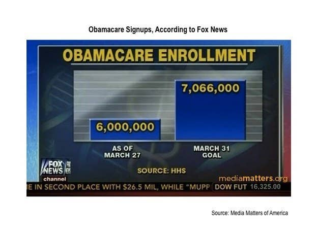
This picture can be misleading, especially to the people who don’t want to think. The 7 million looks as if its 3 times more than the 6 million, but in reality, 6 million is only 1 million short from 7 million. Using a more visually accurate graph could help, and it could help more people think more accurately about the information from the graph.