I chose to look at an article from CBC about Ontario and their proposed minimum wage increase.
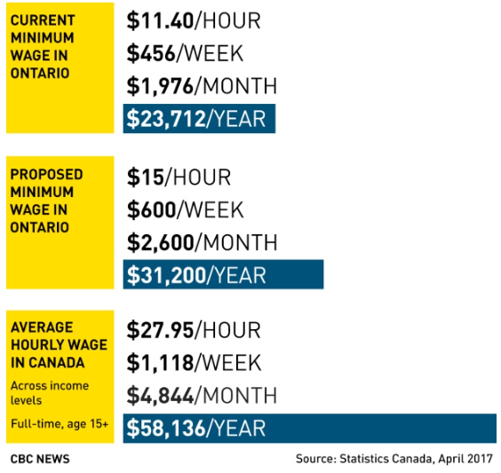
I think this graph is hard to read because it shows you different parts all in the same spot so it make it hard to read. Example: the current minimum wage, proposed minimum wage and the average hourly wage makes it more confusing. This graph is also based off an 8 hour day shift (it is cut off from the bottom) so per month or week have to be recalculated if its based off of say a 7 hour shift or anything not 8 hours.
To make this graph better readable I would have put it into a better structure and made it less wordy. I would have used a line graph and made a separate graph for each part, the amount per hour, week, month and year and just compared the current minimum wage, proposed minimum wage and the average wage in Canada so I could see the difference better that way.
http://www.cbc.ca/news/canada/toronto/ontario-minimum-wage-announcement-1.4137339