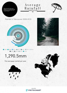
In my science class, we created visualized data presentations to impact the interest in this project. For my project, I chose to do an Infographic poster to demonstrate the precipitation in Vancouver for the past 10 years. I chose this method because I was able to show my research in an artistic and visually pleasing way. I also chose to do my project this was because with the Piktochart website I was able to demonstrate my data with the variety of tools and programs on the website. This project allowed me to collect, demonstrate as well as confidence data into an understandable matter to use in my infographic poster.
Here is my raw data:
Here is my Infographic:
Below is a Core Competency self-reflection that I completed on the project.
Self-Assessment/Reflection Page (Web view)

